Microsoft is changing the Start menu of Windows: Here's how
What's the story
Since the early days of Windows, the Start menu has been a core element of the operating system, something we all love to have and use.
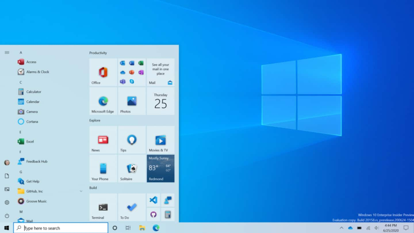
Now, in a bid to improve the experience of the platform, Microsoft is debuting a revamped avatar of Start menu with some subtle but much-needed design changes.
Here is all you need to know about them.
Build
New Insider build with new Start menu
A few hours ago, Microsoft announced a new Insider Preview of Windows 10, giving a glimpse at the new Start menu which looks much cleaner and more coherent than before.
It still works in the same way as before but the colors on the block-y app tiles have now been replaced with a uniform, partially-transparent background that works with both light and dark themes.
Details
Backplates from app list icons also removed
Along with the app tiles, the company has also removed the solid color backplates that used to appear behind app list icons.
"This design creates a beautiful stage for your apps, especially the Fluent Design icons for Office and Microsoft Edge, as well as the redesigned icons for built-in apps, that we started rolling out earlier this year," Microsoft says in its blog post.
Impact
Locating apps would be easier
With these changes, Windows will reduce the focus on individual apps, games, and animated live tiles and create a more streamlined and uniform experience for users.
This will make it easier to scan and locate the apps that are used more frequently rather than those that are there by default (like Microsoft's Xbox console) or not frequently used.
Other changes
What else comes with the new Insider Preview?
The new Preview also brings a new Alt+Tab feature for Edge.
Now, when you are on Edge, hitting the Alt+Tab keys will display all open tabs in a single pane, letting you see what has been opened in which tab rather than viewing them individually.
Also, the default 2-in-1 setting has been changed to automatically switch from PC to the tablet-specific version of Windows.
Information
Graphing mode for calculator, task bar changes
Additionally, the release is also adding the long-requested graphic mode into the native calculator app as well as personalizing the taskbar for new accounts by pinning the Xbox app for Xbox Live users or Your Phone pinned for Android users.
Stable release
No word on stable release yet
That said, it must be noted that these features have just been released as Preview for Windows Insiders in the Dev Channel for testing and improvement purposes.
These updates come from Microsoft's active development branch - which is directly from its engineers - and could change by the time of stable release sometime in the future (timeline not finalized yet).