WhatsApp introduces new bottom navigation bar for Android users
What's the story
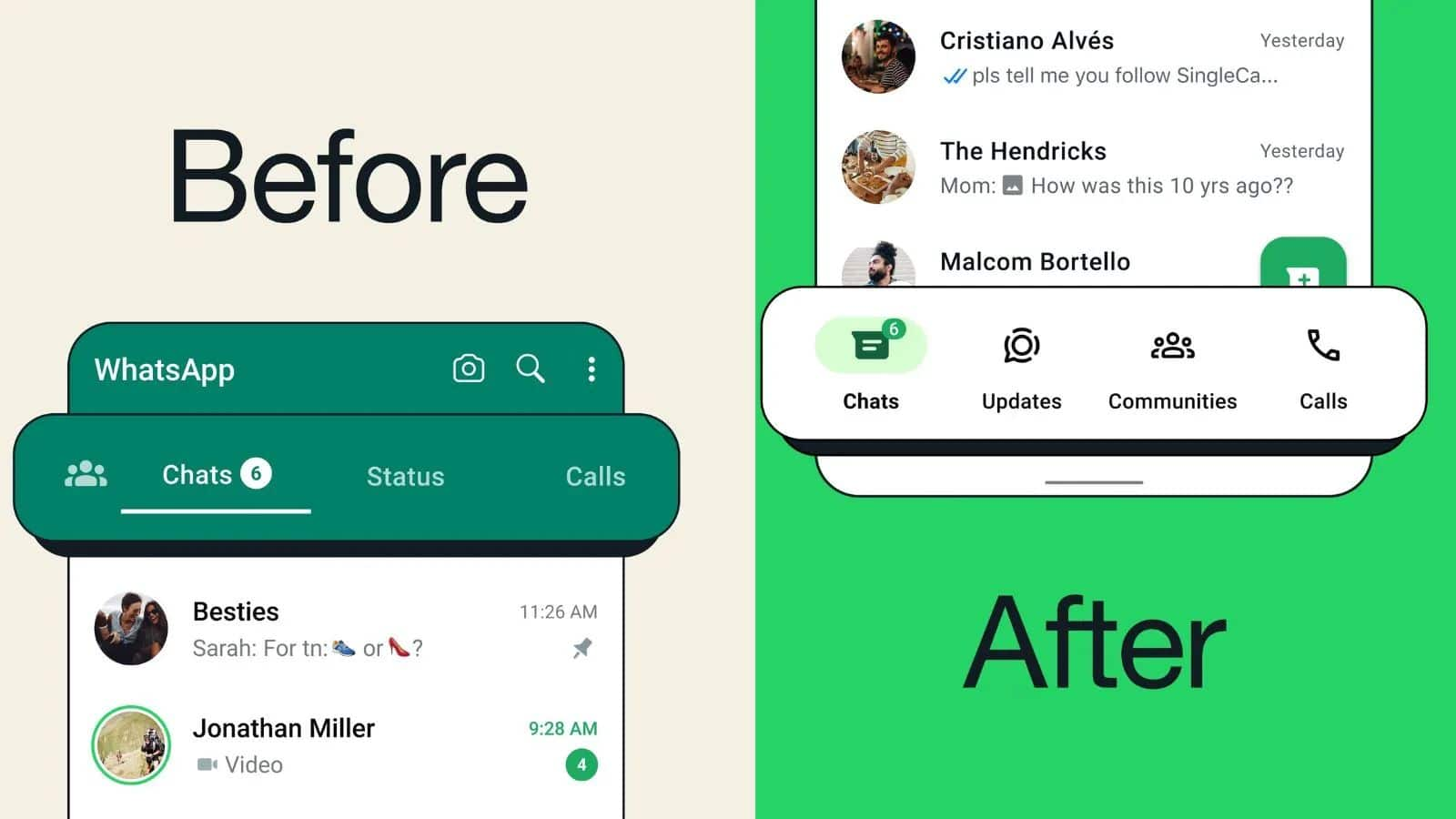
WhatsApp has implemented a new change for Android users, moving the navigation bar from the top to the bottom of the app.
The new setup brings WhatsApp for Android interface closer to its iOS counterpart. The messaging platform has confirmed the change via its X account.
The redesigned navigation bar is being gradually rolled out, meaning it may take a few more days for all users to experience this change.
Update implementation
What's new with the interface?
The redesigned bar now includes an additional tab called 'Updates,' aimed at simplifying access to various app functions.
Per WhatsApp, the latest adjustment allows for easier access as it positions the bar closer to users' thumbs.
Despite the redesign, the app maintains its previous capabilities while offering a sleeker design and improved ease of use.
The change is part of WhatsApp's initiative to adhere to Google's new Material Design guidelines.
New addition
WhatsApp to introduce 'Suggested Contacts' feature
Besides the interface modifications, WhatsApp is reportedly launching a "Suggested Contacts" feature in the Chats tab.
As identified by WABetaInfo in WhatsApp beta for Android 2.24.7.23, this new feature aims to recommend new contacts for users to interact with.
On a related note, WhatsApp is also working on five new features aimed at enhancing the user experience.
These include AirDrop-like file sharing, group event scheduling, customizable media upload quality, video forward/rewind, and status updates composer.