Twitter has introduced new fonts, and users aren't happy
What's the story
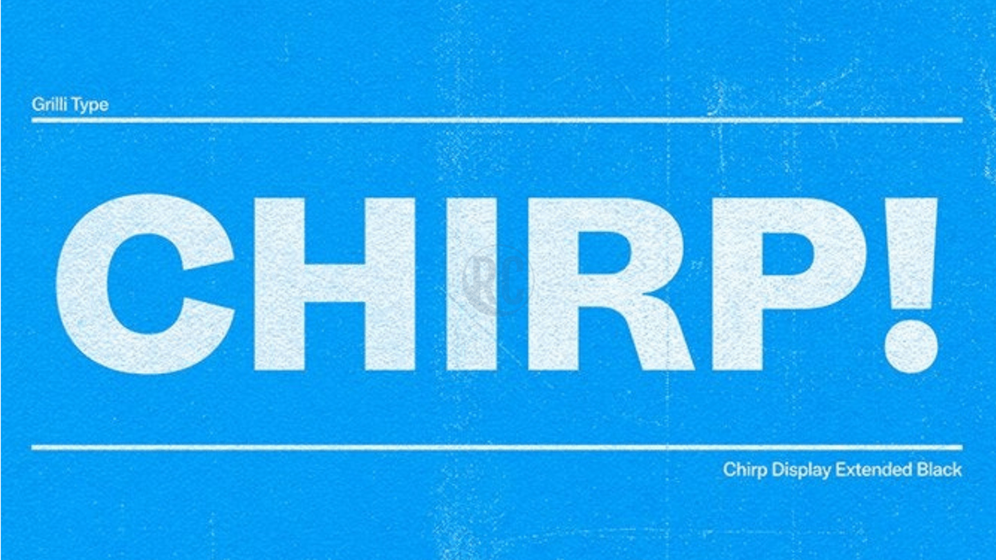
Noticed anything different on Twitter recently? Well, it's intentional. The microblogging platform's Design department announced that alongside a host of tweaks to the web client and mobile app, Twitter has now switched to using its first proprietary font called Chirp.
Twitter has also curbed its liberal use of blue across the user interface and color customization options are in the pipeline.
Here's more.
Back story
Twitter first unveiled Chirp in January 2021
Twitter had first introduced the Chirp typography in January this year. Later, in early-June, reputed application analyst Jane Manchun Wong showcased Twitter's pre-release misinformation labels that happened to use the new Chirp font.
According to Twitter, Chirp can align the text of tweets in Western languages to the left, making it easier to read content on your timeline.
Twitter Post
Twitter's Design department summarizes the new changes
Finally, we cleaned up a lot of visual clutter.
— Twitter Design (@TwitterDesign) August 11, 2021
There are fewer gray backgrounds and unnecessary divider lines. We also increased space to make text easier to read.
This is only the start of more visual updates as Twitter becomes more centered on you and what you have to say!
Easter egg
Twitter's new font balances 'messy and sharp'
Chirp is a part of a brand refresh announced in January. At the time Twitter had said, "Chirp strikes a balance between messy and sharp to amplify the fun and irreverence of a tweet, but can also carry the weight of seriousness when needed."
Meanwhile, The Verge reported that typing "[CHIRPBIRDICON]" in the tweet compose box inserts the Twitter logo, a fun Easter egg.
Twitter Post
However, some users are finding the new fonts headache-inducing
Finding the new Twitter design/font extremely hard to read and headache-inducing, aside from illogical button coloring.
— Jakub Hlavka (@JakubHlavka) August 12, 2021
Am I the only one?#TwitterFont #twitterupdate @TwitterSupport @TwitterSupport
Colors
Twitter promises new colors to stylize app and app icon
Besides that prominent change, Twitter announced that colors across the user interface have been updated for enhanced contrast and the use of blue color has been reduced.
The microblogging platform promised to roll out new colors soon although it didn't specify a timeline.
Twitter Blue subscribers in Canada and Australia can reportedly tweak colors for the app and its icon if they're on iOS.
Confusion
Inverted Follow button color scheme creates unnecessary confusion
The redesign also changes how the Follow button looks. When you haven't followed an account, the button's background will be filled with color.
When you press the button to follow that account, the button's background color will vanish.
This is the exact opposite of how Twitter's Follow button used to look before the change, and it could be frustrating for many users.
Twitter Post
Writer Brian Merchant explains why new Follow button is frustrating
know what makes me want to spend more time on this website? accidentally unfollowing people I was sure I had already followed and then following them again, making them think I had only just now followed them
— Brian Merchant (@bcmerchant) August 11, 2021
love it