Top 5 phones that are truly design disasters
What's the story
With touchscreen becoming mainstream, smartphone design has been centered around offering more and more screen real estate. And this has allowed for newer ideas like notches, punch-hole screens, and pop-up cameras.
But back in the day, manufacturers took some design risks to make their phones stand out from others.
Interestingly, a lot of them failed. Here, we list top 5 design disasters.
#1
Motorola StarTac Rainbow
Motorola's regular StarTac range did well with the flip design and protruding antenna except for the Rainbow model.
Released in 1997, it came with a thickness of 23mm and had a plasticky toy-like design.
The upper side of the flip phone came with an uneven surface painted in un-rainbow colors while the interior was green and yellow.
#2
Toshiba G450
Launched in 2008, Toshiba's G450 looks anything but a phone.
With a miniaturized circular screen and rounded T9 keypad portions, the device looks more like an MP3 player or AC remote than a feature phone.
And while texting was a challenge on the Toshiba G450, it did support 3G network and offered a battery back up of up to 200 hours.
#3
Nokia 7280
While Nokia has produced some stunning phones, the company went a little too over the top with its 7280.
Shaped like a lipstick, the phone had a tiny 208 x 104 pixels screen and navigation buttons on the side.
Moreover, instead of a T9 keypad, it featured a touch-sensitive rotating wheel called the Navi spinner which allowed you to select alphabets and letters.
#4
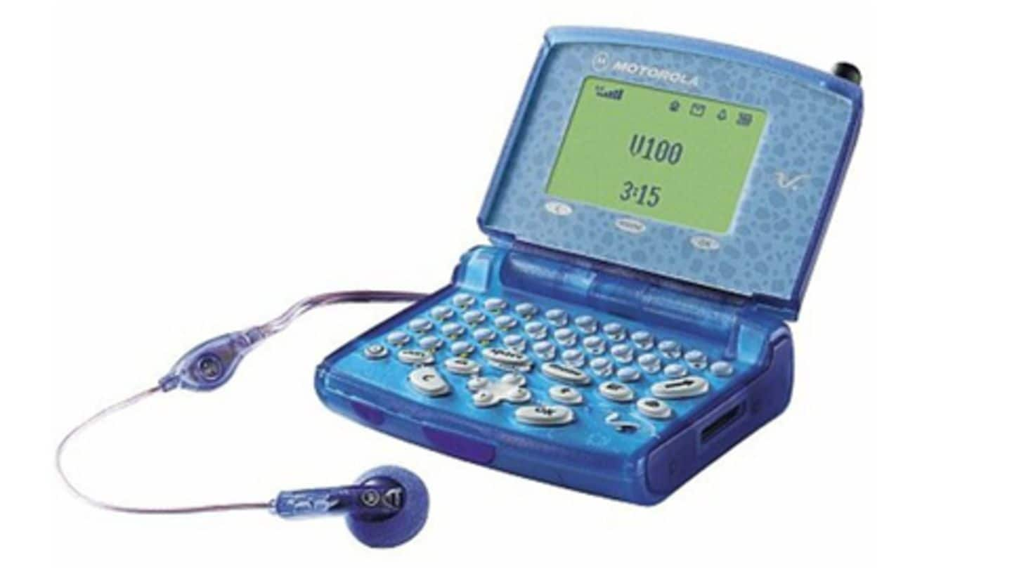
Motorola V100
Motorola has made some really bad design decisions, and its V100 is a proof of the same.
Released in 2000, the phone had a cheap, transparent plastic body, unsavory patterns around the display, and a chunkier built with 2.5cm thickness.
But if one could get past the hideous looks, the phone did offer a well-laid out QWERTY keypad.
#5
Samsung Upstage
While dual-screen smartphones may sound relatively new, Samsung actually adopted this design way back in 2007 on its Upstage phone-cum-music player.
The 2-in-1 device offered a 2.1-inch display and touch-sensitive music control keys on the front whereas the rear side had a tall numeric keyboard, a tiny 1.4-inch display and a 1.3MP camera on the back.
Unsurprisingly, it didn't do well with the masses.