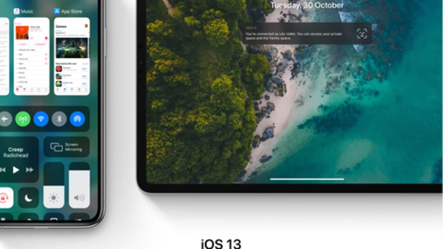
This iOS 13 concept with redesigned interface is truly amazing
What's the story
In a matter of months, Apple will host the Worldwide Developers Conference to unveil iOS 13. The next update from the Cupertino giant has long been rumored to incorporate major changes, particularly on the design front. But now, designer Leo Vallet has released the concept for iOS 13, envisioning how these improvements might actually look like. Here are the details.
Feature #1
New Dark Mode for iPhone, iPad users
Among various features tipped for iOS 13, a dedicated Dark Mode is one of the leading contenders. Though it has not been confirmed by Apple, Vallet used design skills to envision how the Dark Mode would look like when enabled. He imagined an all-black screen with colored icons and a clean interface to enable the feature aimed at maximizing battery life.
Feature #2
Multi-tasking panes merged with control center
In another illustration, Vallet showcased how Apple might use the extra screen real-estate of the new iPhones. He imagined an interface where the multi-tasking panes and the control center showed up on the same screen. As such, they both could be accessed from a simple swipe-up action, instead of the current slide-down mechanism from the top-right corner.
Feature #3
Redesigned volume UI and external display connectivity
The volume interface of iOS 12 appears at the center of the display and has long been due for an update. This is something that Vallet fixed in his concept by repositioning the volume HUD and placing it on the left, in line with the volume rockers. He also envisioned native support to use iPad as an external display with a Mac.
Information
Other features imagined in the concept
Along with the rumored capabilities, Vallet also imagined some additional capabilities like mouse support for iOS, automatically-activating Lost Mode in Find My iPhone, and a lot more.