How to customize your iPhone's home screen in iOS 18
What's the story
Apple's latest software update, iOS 18, is now available for download via the Settings app. It introduces a pool of new features to users. Among the most notable changes is the ability to personalize your home screen. This feature allows users to remove app labels, change app icons' color, and rearrange apps on their screen in unique ways. Here's how to customize your iPhone's home screen.
Icon labels
Removing app labels
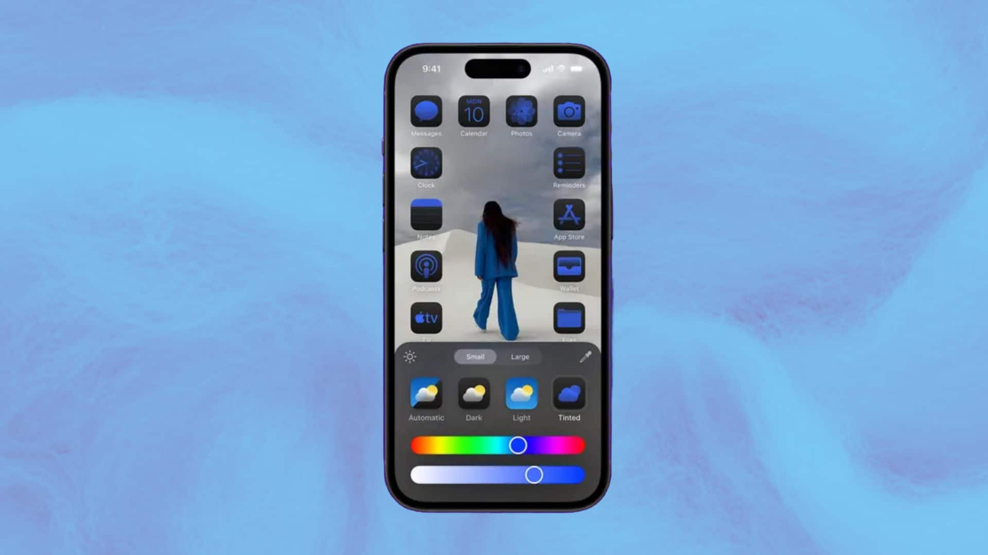
To remove app labels, users need to long-press on their background to enter 'jiggle mode.' Then, they should tap 'Edit' in the top left corner of their screen and select 'Customize.' By choosing 'Large' in the new menu that appears at the bottom of your screen, app icons will grow and labels beneath them will disappear. If users prefer smaller icons with visible labels, they can repeat these steps but select 'Small' instead.
Color customization
Changing the color of app icons
The iOS 18 update also allows users to change the color of their app icons. To do this, they need to enter 'jiggle mode' by long-pressing on their background. After tapping 'Edit' and then 'Customize,' users can select the icon labeled 'Tinted.' This action opens a gradient scale at the bottom of this menu, allowing users to adjust until they find their desired hue.
Dark mode
Darkening icons and background
The new update also provides an option to give apps a darker background. By selecting the icon labeled 'Dark,' Apple's first-party apps like Messages, Safari, and others will now have an almost-black background. This change applies to some third-party apps like YouTube and Bluesky as well. However, apps like Instagram and Snapchat will remain unchanged. Additionally, users can darken their wallpaper without affecting their app icons by tapping the sun icon in the top left corner of the new menu.
App arrangement
Arranging apps on home screen
The process of arranging apps on the home screen remains unchanged. Users can enter 'jiggle mode' by long-pressing on a blank portion of their background and then dragging apps where they want them. The grid will still remain, preventing users from placing apps too close together or on top of each other. If users enlarge their apps, there will be a significant gap between their dock across the bottom of their screen and the lowest row of the grid.