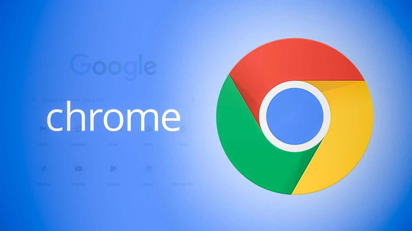
Google Chrome browser gets new logo; here's what changed
What's the story
Tech behemoth Google is changing the logo of its popular web browser Google Chrome after eight years.
A designer for Google Chrome, Elvin Hu, tweeted the first look of the new logo and said it will provide a "modern experience" for the product.
The modifications were made based on the various operating systems that Chrome runs on, said Hu.
Context
Why does the story matter?
The Google Chrome logo has only been changed four times over a span of fourteen years.
Chrome is notably one of the most popular internet browsers used by millions of people all over the world.
Since 2008, the browser logo has been gradually toned down to a simpler 2D logo from a bright 3D icon.
Modifications
What has been changed?
"Some of you might have noticed a new icon in Chrome's Canary update today. Yes! we're refreshing Chrome's brand icons for the first time in 8 years. The new icons will start to appear across your devices soon," tweeted Hu.
The shadows have been removed and the colors are made more vibrant in the logo.
The proportions have also been changed.
Modifications
'We introduced a very subtle gradient'
Hu further said on Twitter that a subtle gradient has been added to each color instead of the earlier use of flat, block colors.
This was done as "certain shades of green and red next to each other created an unpleasant color vibration," Hu said.
These changes make the blue ball in the middle appear bigger
Twitter Post
Transformations are seen in ribbons of logo
On iOS, our Beta app will start using a blueprint-like design, as a nod to Apple’s developer-focused apps, and the Stable app icon will have new proportions on the tile. pic.twitter.com/kkIeJkv8Uj
— Elvin 🌈 (@elvin_not_11) February 4, 2022
Information
Why was the logo redesigned?
"We tailor Chrome's experience to each OS, with features like Native Window Occlusion on Windows, day-one M1 support on macOS, Widgets on iOS/Android, and Material You on Android. We want our brand to convey the same level of care," Hu tweeted.
"We explored introducing more negative space. However, in context, the white required a stroke that shrunk the icon overall," he added.
OS-specific
OS-specific customizations
Google is also customizing the logo with multiple variations that will look better on iOS, Windows, and macOS.
"We created OS-specific customizations. We want the icons to feel recognizably Chrome, but also well crafted for each OS. For example, on Windows, the icons take on an obviously gradated look, appearing at home on Windows 10 and 11," Hu tweeted.
Do you know?
Currently available on Chrome Canary
According to Hu, if anyone uses Chrome Canary (the developer version of Chrome), they can notice the new icon. With the release of Chrome 100, users will be able to see the redesigned Google Chrome logo on all devices soon.