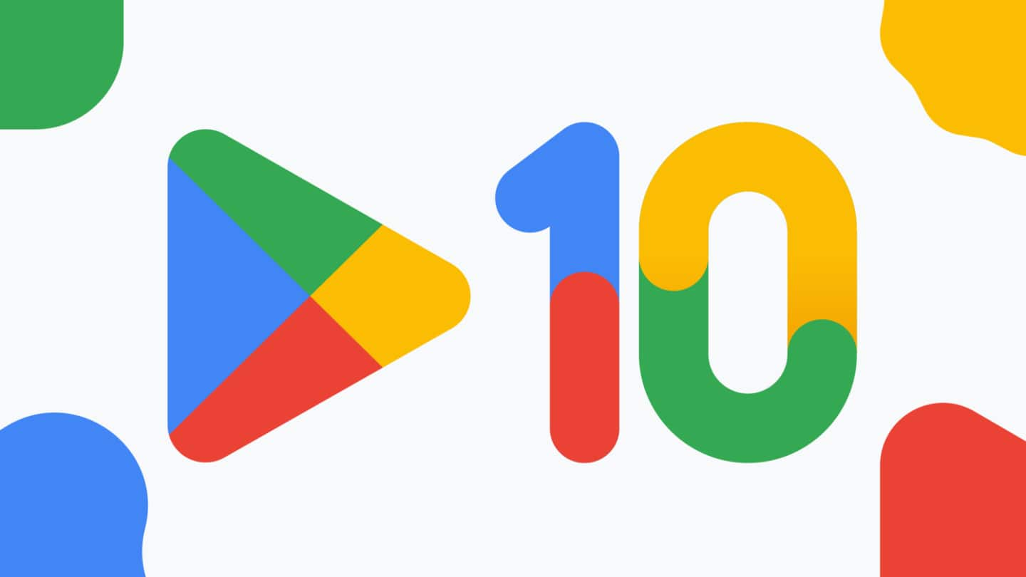
Google Play celebrates its 10th birthday with new logo
What's the story
Can you believe that it's been 10 years since Google rebranded Android Market to Google Play? Now, as part of its 10-year celebration, Google Play gets a new logo. The new logo has less vibrant colors that match hues of other Google services logos. The company is also offering Play Points members a 10x points boost on purchases.
Context
Why does this story matter?
Google Play, the world's largest app store, is celebrating its 10th birthday. The company has decided to make it special by releasing a new logo. The new logo with less vibrant hues brings it closer to other Google services. It is a fitting celebration for a service that has brought the company a lot of profit and recognition.
New logo
Colors on new Google Play logo resemble updated Chrome logo
Google Play's old logo had bright blue, green, red, and yellow shades. The new logo has the same colors but is very low-key or less vibrant. The hues are similar to what Google uses for many of its services. The subtle adjustments also make it similar to the recently updated Google Chrome icon. Let's hope that no one gets confused by the new logo.
Twitter Post
Here is Google's gif to celebrate the occasion
This year marks our 10th year of Google Play-ing. To celebrate, we're offering Play Points members a 10x points boost, starting today. How has it been a DECADE 🤔🤯🤔 Claim your points boost here: https://t.co/xoVIQsxHns #PlayTurns10 pic.twitter.com/76pQbQqDBY
— Google Play (@GooglePlay) July 25, 2022
Information
The new logo matches brandings of other products: Google
Speaking about the change to the logo, Tian Lim, VP of Google Play, said, "We're introducing a new logo that better reflects the magic of Google and matches the branding shared by many of our helpful products — Search, Assistant, Photos, Gmail and more."
App store
Google Play has over 2.5 billion monthly users
Android Market was launched in 2008 and got rebranded as Google Play in 2012. The official app store for Android now has over 2.5 billion monthly users in over 190 countries. Also branded as Google Play Store, it works with over two million developers as well. You'll be shocked to know that there are over 3.4 million apps in the Play Store.