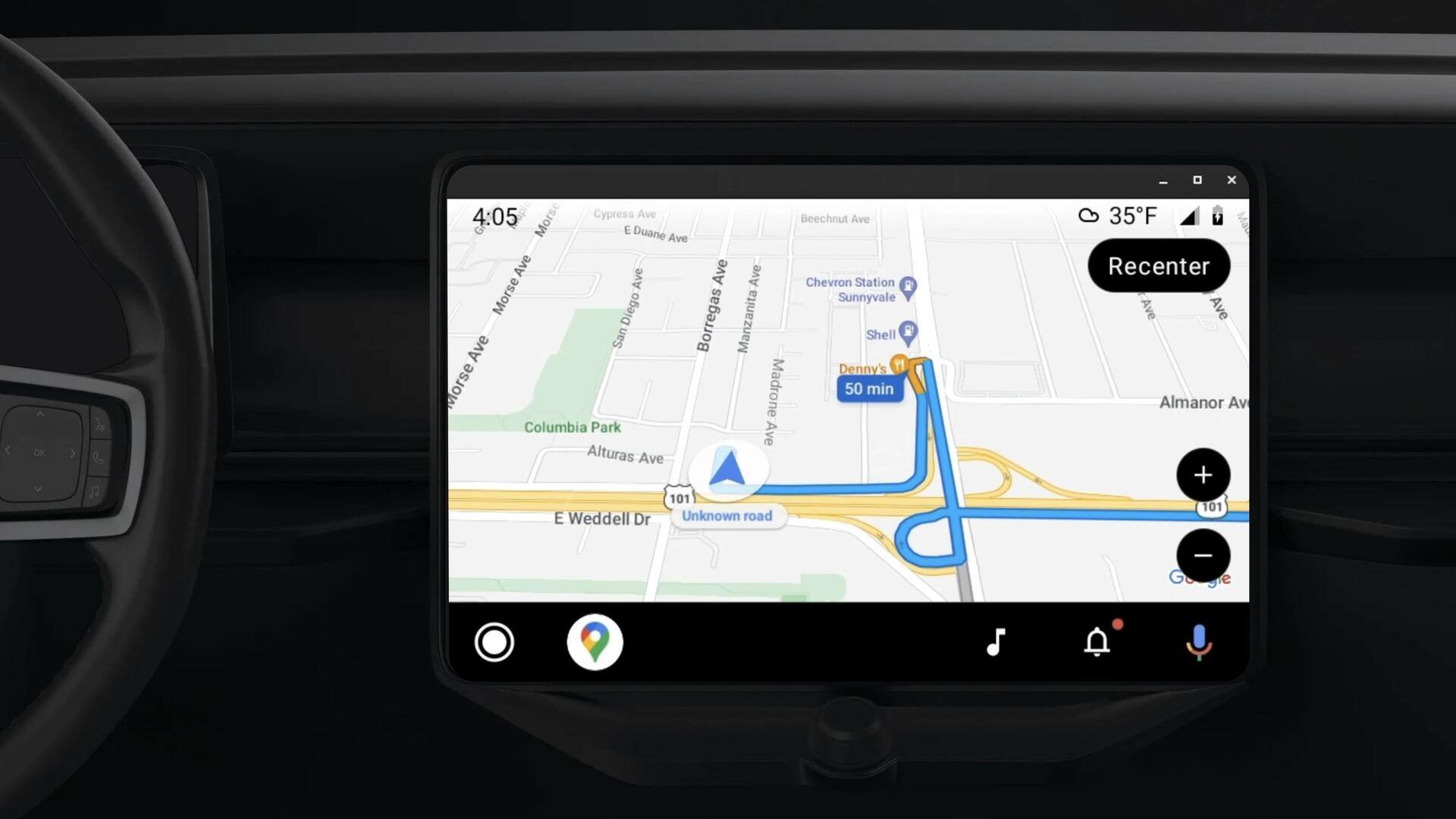
Google Maps for Android Auto receives color scheme update
What's the story
Google Maps recently introduced a refreshed color palette for mobile and web clients, and this change is now visible on the Android Auto platform, too.
With the latest update, the interface has switched from warm hues to a cooler color scheme for maps.
Initially implemented across web, Android, and iOS platforms, the update now aims to enhance user experience on Android Auto as well.
Details
Cooler color scheme apparent across entire map
With the updated Google Maps on Android Auto, parks and forests now appear in a mint shade, replacing the former green color. Roads have also transitioned to a gray color.
This cooler color palette is evident throughout the map and in key aspects of the user interface (UI), such as text, the blue navigation line, and the direction card at the top of the UI.
Scenario
Update has gathered mixed reactions from users
The revamped color palette for Google Maps has received mixed feedback from users.
Some find the change off-putting, while others welcome the improved usability. Some individuals have even expressed distaste for the new color scheme.
However, it remains to be seen how most users will adapt to and embrace these changes as they roll out to everyone in the coming days.