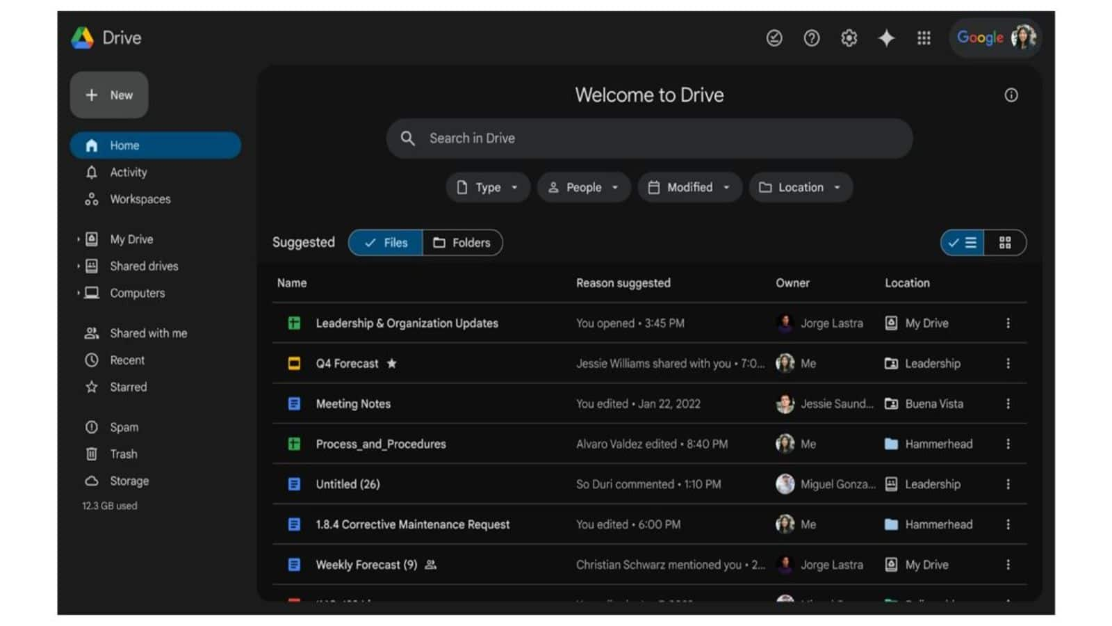
Google finally rolls out dark theme for Drive storage platform
What's the story
Google Drive, the popular online storage platform, has officially introduced a much-anticipated dark theme. The company made the formal announcement yesterday (April 16), after the feature was first spotted nearly a month prior. According to Google, this new dark theme is designed to provide a "more comfortable, customizable viewing experience for Drive." It will be offered to all Google Workspace customers, Individual users, and those with personal Google accounts.
Steps
How to enable the new dark theme?
Upon the launch of dark theme, users will be greeted with a "New! Dark mode" notification, inviting them to "Continue to enjoy Drive in the dark." To activate it, users need to click on the gear icon located in the top-right corner of their screen. They then have to navigate through Settings > General > Appearance. Note that this new theme does not automatically align with your device's theme, and is only applicable to the file view in Google Drive.
Theme details
Google Drive's dark theme appearance
The dark theme on Google Drive features a lighter gray backdrop for elements such as the sidebar and search bar. The inner container, where files are displayed, is darker or black. However, this theme does not extend to other Google applications like Docs, Sheets, and Slides which remain unaffected. This new addition aligns Google Drive with other services like Keep and Chat which also offer dark themes.