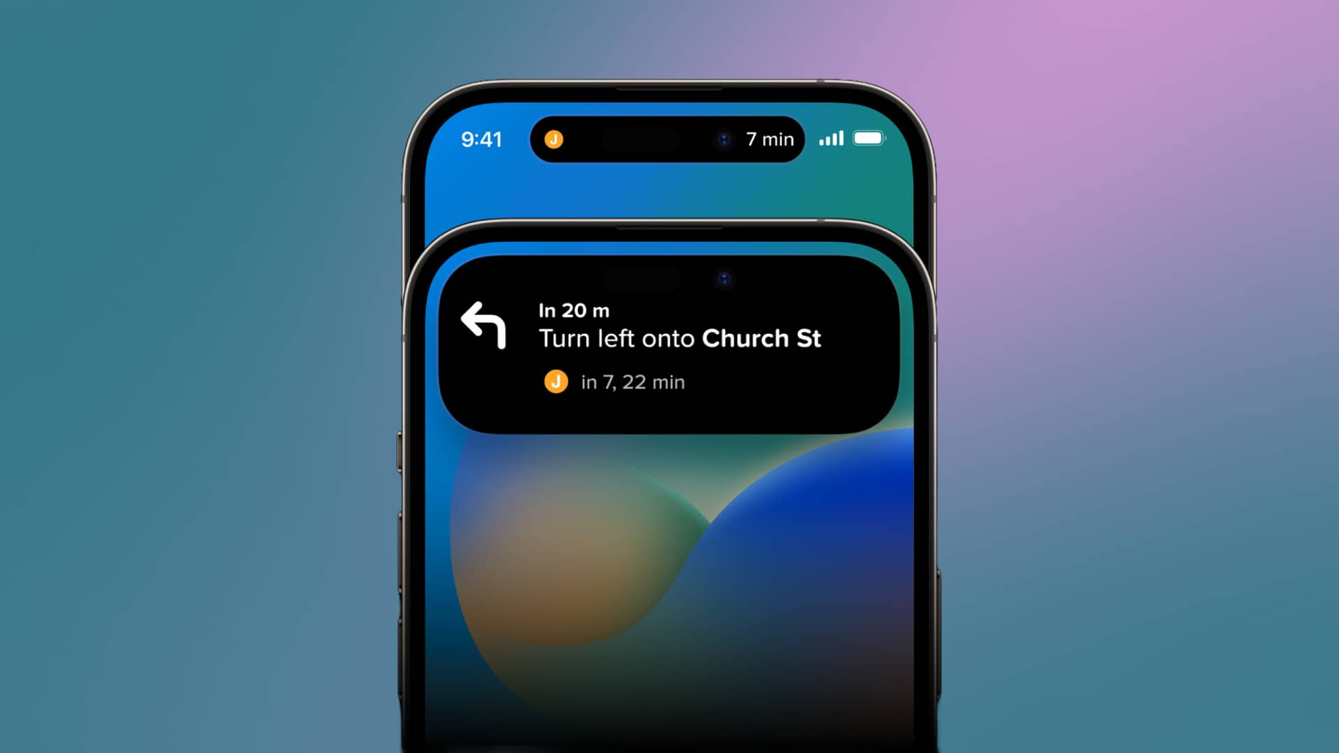
Apple explored numerous concepts before finalizing iPhone's Dynamic Island design
What's the story
Apple introduced Dynamic Island on the iPhone 14 Pro models in 2022, intending to transform the notch area to display various information like system alerts and sports scores. However, before settling on the current design, Apple considered several other concepts, per MacRumors. One idea was a pop-over menu on the screen's right side, displaying time, signal strength, brightness, battery level, and volume. Another concept involved hiding the notch with an all-black status bar, potentially saving battery life on OLED displays.
More ideas
Alternative concepts explored by Apple
The initial design for Dynamic Island was a permanent elongation across the screen's top. However, Apple decided it would be less intrusive if it changed size as needed. Then, the company also explored displaying volume controls and system shortcuts within Dynamic Island and experimented with a never-used layout for ongoing phone calls. Dynamic Island is now available on all iPhone 15 models, while iPhone 13, iPhone 14, and 14 Plus still have a notch.
Tip-offs
Evolution of Dynamic Island design
Rumors suggest that Apple might eventually eliminate the Dynamic Island on iPhone Pro models by moving the front camera and Face ID sensors under the display. Ross Young of Display Supply Chain Consultants (DSCC) predicted this change could start with the iPhone 17 Pro, while non-Pro models might not see it until the iPhone 18 at the earliest. This development could further improve the iPhone's display and overall user experience.
Insights
Future developments for iPhones
The Dynamic Island feature has made the iPhone's notch area more functional, but future models may see even more significant changes. By moving essential components under the display, Apple could potentially enhance the screen and user experience even further. For now, though, iPhone users can enjoy the versatility of the Dynamic Island on their devices.