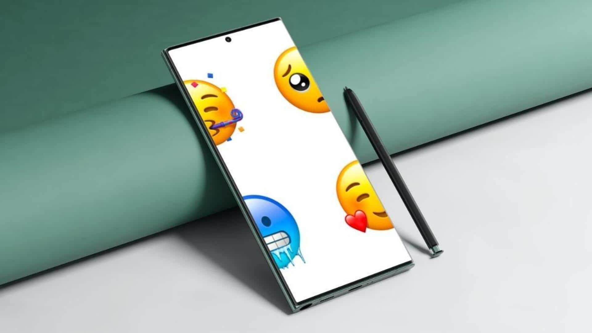
These emojis look noticeably better on Android than iOS
What's the story
The emoji universe is pretty diverse and subjective, with each platform having its own twist. While many folks swear by Apple's iPhone emojis, a closer inspection shows that some Android emojis actually steal the show when it comes to detail, clarity, or design. So, here are examples where Android emojis totally win!
Emoji #1
'Face in clouds': A dreamy depiction
The "Face in clouds" emoji perfectly showcases how Android and iOS have their own unique design styles. On Android, this emoji has a face peeking out from behind a fluffy cloud, which really captures that daydreaming vibe. But on iOS, the face is fully visible, yet it's surrounded by a thick haze, which can come off as a bit creepy or give you that overwhelming feeling.
Emoji #2
'Nerd face' looks better
The "Nerd Face" emoji has another case of Android winning. While Google's take is pretty straightforward with just glasses, iOS goes the extra mile by adding buck teeth. Some folks might find that addition by Apple a bit extra or even offensive, making Android's version a more universally appealing pick.
Emoji #3
'Pineapple' stands more upright
The "Pineapple" emoji is another spot where Android is winning. While iOS shows the pineapple leaning a bit and in some dull colors, Android displays it standing straight with bright, vibrant colors that make it look more lifelike and cool. This design difference can really matter when you're texting about your love for this tropical delight!
Emoji #4
'Ghost' offers a playful and balanced design
When it comes to the "Ghost" emoji, Android has the upper hand. Google's version has this cute little wink, giving it a fun vibe. But on iOS? The ghost has two eyes, and one of them is way larger than the other! It really throws off the whole look and makes it seem a bit weird.
Emoji #5
'Strawberry' is vibrant and fresh
The "Strawberry" emoji is another case where Android steals the show from iOS. Apple's version is a bit dull, missing the vibrant colors you'd expect from this fruit. In contrast, Android's strawberry emoji is all about those bright reds and greens, making it look fresh and appealing. This small design difference can really make your texts about this juicy fruit stand out!
Emoji #6
'Ramen' offers richer and enticing design
The "Ramen" emoji is yet another instance where Android takes the crown. Google's version goes all out, showing off eggs, toppings, and a rich broth that makes the dish look downright drool-worthy. But when you look at it on iOS, the ramen seems a bit bland and basic, making it less appealing. This difference can really jazz up your texts about this tasty dish.
More examples
Android's 'Beaver,' 'jellyfish,' and 'shooting star' ace the race
Android's beaver emoji is more cartoonish and playful, perfectly fitting the emoji vibe, while iOS's realistic design loses some of its charm. Android's pink jellyfish feels familiar, appealing to Finding Nemo fans, while iOS's blue one seems off. The pink gives the jellyfish a soft, lifelike feel, while iOS's choice feels less accurate. Additionally, Android's shooting star emoji features a clear trail, enhancing its movement, whereas iOS's version lacks this, making it feel static and less dynamic.
Information
'Waffle' is more detailed and appetizing
The "Waffle" emoji is another spot where Android wins. Google's has a perfectly placed pat of butter melting on top, while iOS keeps its waffle plain. This small but significant difference makes the Android version look more detailed and appetizing than its iOS counterpart.