BJP posts graph on "truth of petrol hike", gets trolled
What's the story
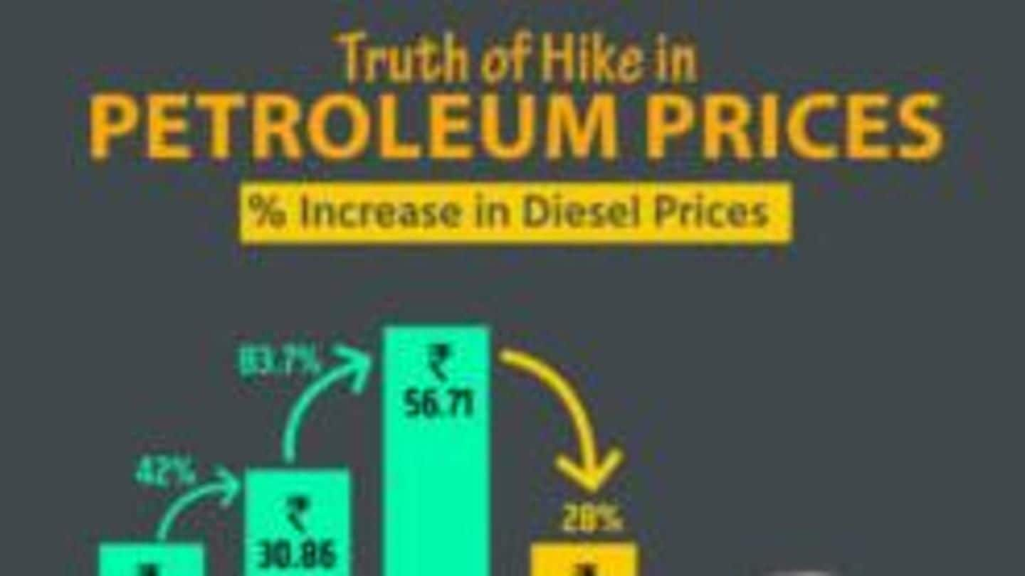
Who doesn't know about BJP's version of 'truth' that's often based on assumptions, and not facts? Well, seems like this time BJP outdid itself. The ruling party tweeted two infographics titled 'Truth of Hike in Petroleum Prices' to show the rate of fuel prices' hike over the years. And, naturally it didn't go down well with the Twitterati, Congress or any logical person.
Twitter Post
The 'Truth' behind the hike
Truth of hike in petrol prices! pic.twitter.com/hES7murfIL
— BJP (@BJP4India) September 10, 2018
Explained
Graph or Gaffe?
The petrol graph shows that the rate at which petrol prices have surged has increased by 13% between 2014-18, which is a drop if compared to the hike between 2009-14 at 75.8%. However, rather than depicting the drop in '% rate', the graph shows a drop in absolute 'prices'. And the photoshop sarkar's bar depicts that Rs. 80.73 is actually lower than Rs. 40.62.
Twitter Post
And, the 'Truth' continues
Truth of hike in diesel prices! pic.twitter.com/gF7CWHeiti
— BJP (@BJP4India) September 10, 2018
Information
Explanation for Diesel graph
BJP again showed a sharp decrease in the hike percent from 2014 to 2018 in their infographics on diesel prices by showing a drop in the price bar, when actually diesel prices have risen to Rs. 72.83 from Rs. 56.71.
The Trolling
The Congress Graph
Naturally, Congress was quick to pick out and rectify the mistakes in BJP's graph, using their own creativity. They made their graph showing the ACTUAL hike and also compared the Indian Basket Crude Oil prices for the respective years. Obviously, Twitter had a field day and humor was the base, all at the expense of BJP and their photoshopped gaffe (graph).
Twitter Post
The "correct" graph
There! Fixed it for you @BJP4India#MehangiPadiModiSarkar pic.twitter.com/kbKBjUi0M7
— Congress (@INCIndia) September 10, 2018
Twitter Post
Always knew my 50% were more than Sharma Ji's 90%
Thankyou BJP for this.
— Tony ⭐क (@TonyBhaiya_) September 10, 2018
I'm gonna show this to my parents..
I can prove them that my 50 % marks in 12th std is a performance improvement over 60 % in 10th.
The Jumlanomics
Why blame Congress?
If the BJP believes that the high fuel prices are caused because of the foreign oil-producing companies, why and how did it blame the Congress for fuel price rise during its tenure? The BJP, in its jumlas, often criticized the UPA for inflation and fuel prices. Does it mean that it had the solution to it? If yes, why not implement it now?
Information
Who's the designer? The Nation wants to know!
All jokes and logic apart, the billion dollar question is: whose idea was it to draw the chart? Did the designer also believe in BJP's approach of "Present a beautiful data if the real one is too ugly"? Or was it someone's idea of joke?