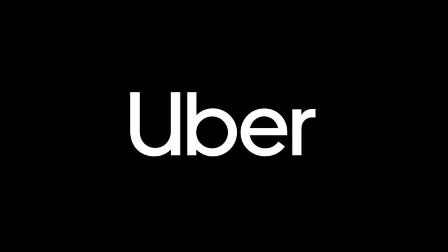
Uber is getting a new look as part of rebranding
What's the story
Following myriad troubles, Uber, over the past year, has been trying to convince its customers that it has turned over a new leaf.
The new Uber has now manifested itself in rebranding, that has seen the company's logo redesigned.
Now, Uber's logo simply reads 'Uber' in a modern, friendly, black-and-white design.
Still, it's an improvement over the intimidating 'UBER' of earlier days.
Here's more.
Rebranding
Uber is now using its own, exclusive font
Unlike Uber's earlier logo which used the Clan Pro font (that was also used by several other brands), Uber's new logo uses its very own Uber Move font, designed exclusively for the company's use.
Uber says that the rebranding is primarily aimed at establishing the company as a brand, and not just perpetuate its image associated with cab rentals.
Apps
The redesigned logo has made it to Uber's app too
While the new logo was unveiled on Uber's website, it has also made its way to the Uber mobile app, and the UberEats app.
Both the apps now sport the redesigned, simple-looking logo, that reads Uber with a capital 'U'.
However, apart from the logo redesigning, Uber hasn't made any notable design changes to its ride hailing and food ordering apps.
Timing
Uber looking for a fresh start with its rebranding
Uber's rebranding has been in the works for nine months now, presumably under recently appointed CEO Dara Khosrowshahi's leadership.
Notably, the redesigned logo comes just two days after Uber appointed Coca Cola veteran Rebecca Messina as its marketing chief.
With the company tried to move past founder and ex-CEO Travis Kalanick's mess, the rebranding exercise couldn't have been better timed.