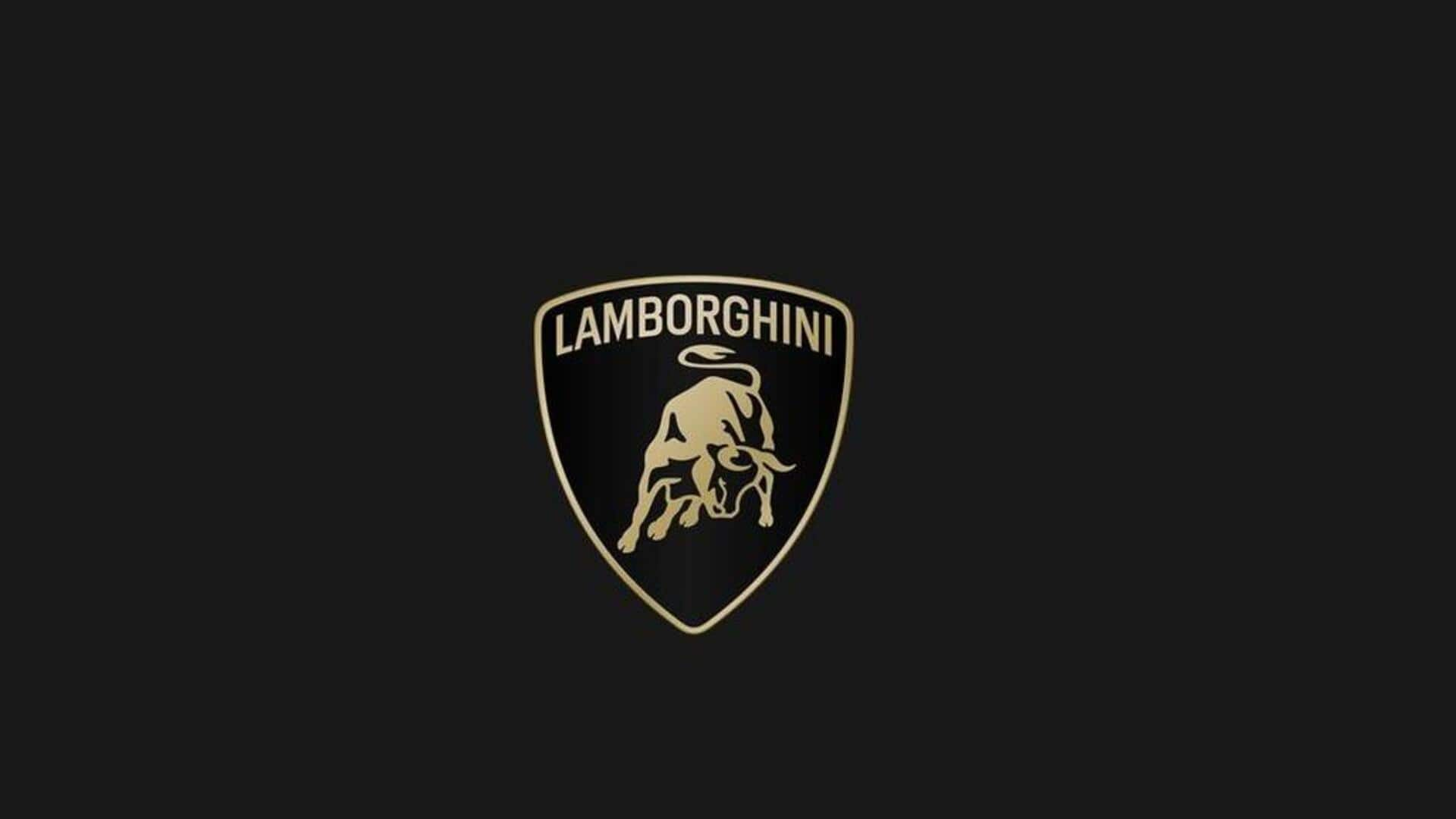
Lamborghini's new logo looks a lot like the 20-years-old one
What's the story
Lamborghini, the renowned Italian luxury sports car manufacturer, has unveiled a refreshed version of its iconic raging bull logo.
This marks the first modification to the emblem in over 20 years. The new design is slightly simplified, moving away from its previous 3D appearance.
The changes might go unnoticed unless one is a Lamborghini aficionado or a logo enthusiast.
Brand metamorphosis
New logo reflects Lamborghini's brand evolution
The updated logo signifies more than just a revamped badge for Lamborghini. It represents a broader transformation of the brand.
The word "Lamborghini" at the crest's top now has a "broader" look, thanks to a newly designed official typeface that mirrors the sharp lines of its vehicles.
According to Lamborghini, this revised logo encapsulates the "brave, unexpected, and authentic" ethos of their mission, which includes "Driving Humans Beyond."
Twitter Post
Take a look at the new logo
We have renewed our historic logo to adapt the brand's visual expression with the "brave," "unexpected," and "authentic" values of our "Driving Humans Beyond" mission and is part of the ongoing process of evolution, initiated with our Direzione Cor Tauri strategy.#Lamborghini
— Lamborghini (@Lamborghini) March 28, 2024
Color transition
Color scheme harks back to the 70s
The primary colors for the logo have transitioned to black and white, with yellow and gold emerging as new secondary colors.
This color scheme is reminiscent of the early 70s. Following its reveal, Lamborghini promptly started using the new logo on its social media platforms.
However, it was displayed without the shield to highlight the iconic bull.
Digital adaptation
Shielded logo to remain on Lamborghini vehicles
Despite the digital adaptation of the logo without the shield, Lamborghini confirms that the shield will remain on its vehicles.
The unshielded bull is exclusive to its online presence.
The refreshed identity will be incorporated into all of its cars henceforth as part of Lamborghini's commitment toward sustainability and decarbonization, reflecting their ongoing process of evolution.