Jaguar unveils new logo, brand identity for its electric future
What's the story
Jaguar, the iconic British carmaker, has unveiled a new logo and brand identity as it moves into an all-electric vehicle (EV) brand.
The new corporate identity was unveiled alongside logos for Jaguar's upcoming electric GT concept car. This would be the company's first completely new vehicle in years.
The rebranding comes just as the production of F-PACE, Jaguar's last model in global markets, ends.
Logo transformation
New logo features a unique font
The revamped logo comes with a unique font, which the company describes as rounder and more open.
This is what the firm calls the 'Device Mark' and it uses both uppercase and lowercase letters.
The Device Mark just spells out 'Jaguar' in a clean and simple font, marking a major departure from its previous design.
Brand elements
Jaguar's Artist Mark and Strikethrough explained
Another aspect of Jaguar's new identity is the 'Artist Mark,' a monogram made up of the letters 'j' and 'r' from the new font, placed inside a circle.
The design makes sure that the Artist Mark looks upright even when flipped upside down.
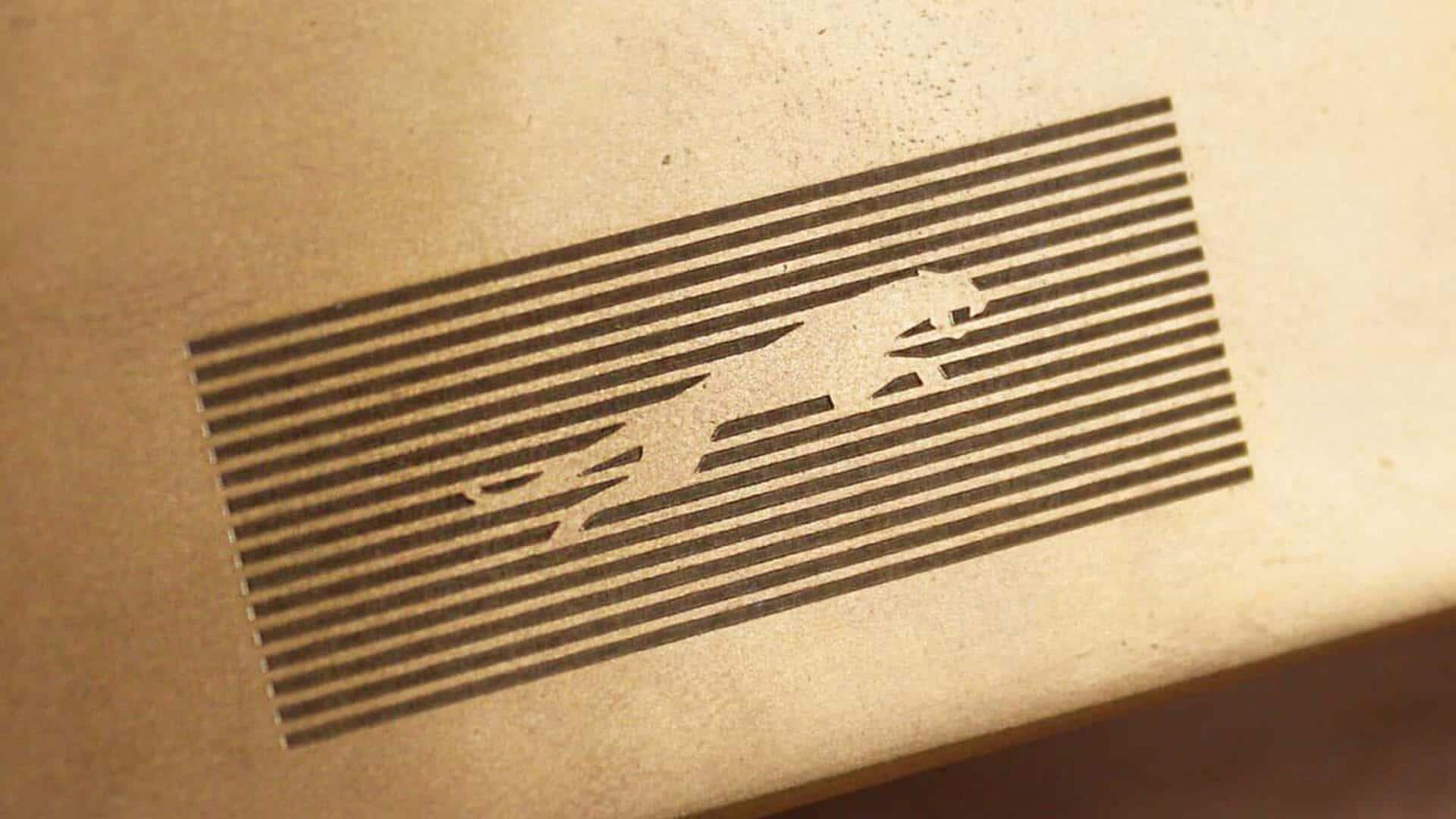
Jaguar has also introduced a feature called the 'Strikethrough' - horizontal lines that can be used alone or with other elements.
Legacy element
Makers Mark: A nod to Jaguar's heritage
The 'Makers Mark' is a Strikethrough variant that includes the 'leaper,' Jaguar's iconic leaping cat logo. This appears to be the only element carried over from the company's old brand identity.
The Makers Mark offers a fresh take on the classic leaper logo, combining tradition with innovation in Jaguar's rebranding strategy.
Brand philosophy
Vibrant colors and movement in Jaguar's new identity
Jaguar's new brand identity will also include vibrant and dynamic colors as a key element.
The company has said that these colors will always be "presented with texture or movement."
This fits perfectly with Jaguar's new brand philosophy, called 'Exuberant Modernism,' which embraces bold designs and original thinking to create a brand character that commands attention.